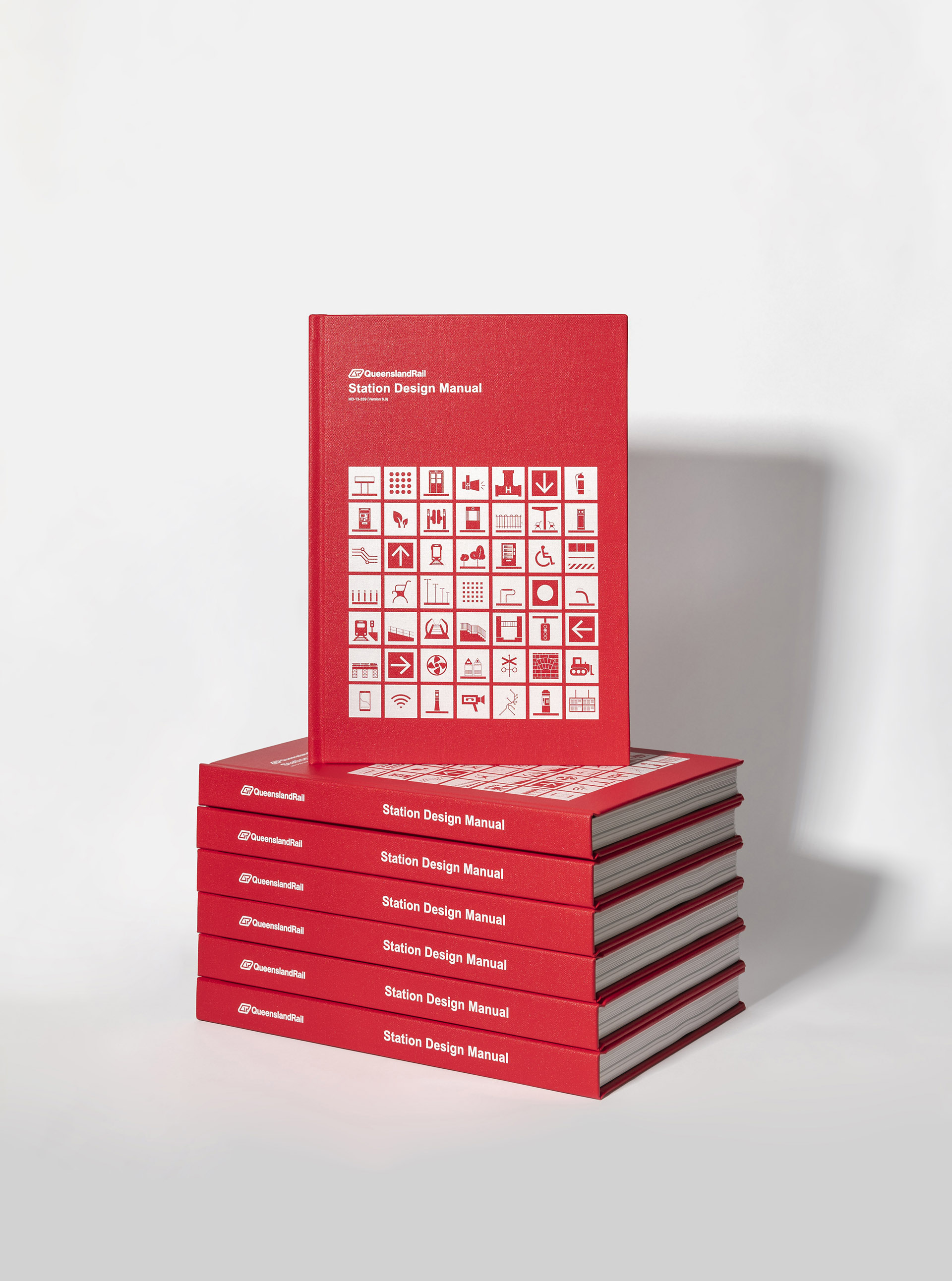
Working with Queensland Rail, we provided a full overhaul of their Station Design Manual, a key document in the suite of reference documents for station upgrades statewide. The outcome is a complete and concise guideline which establishes a set of objectives, design principles, and requirements for a consistent approach to the design, construction and refurbishment of stations.
Process milestones included:
In order to increase usability, navigation and engagement, a new graphic language was developed, inspired by station elements. In addition to alternating icon designs that relate to each chapter, it was identified that a number of graphic devices would be required to best communicate the large amount of information housed within the manual. A combination of illustrations, diagrams and icons were designed, all featuring the red network brand colour. The regional stations’ chapter is identified by Travel Train blue in the same iconographic style.
The result is a unified Station Design Manual that is purpose-built for reference and engagement by both new and experienced station designers and consultants.
2022 Good Design Award Winner — Communication Design
2021 Best Design Awards — Editorial and Books Finalist
2021 AGDA Awards — Books – Entire Book Finalist
Super slick and strong new brand for the Queensland Rail Station Design Manual. It addresses the brief well and uses clear information hierarchy to explain elements of the manual through use of chosen typography and colour. The new illustration and iconography are fitting to the brand. This project sets the new brand up for success due to strong consistency and learnability. Well done.
The Good Design Awards Jury, 2022