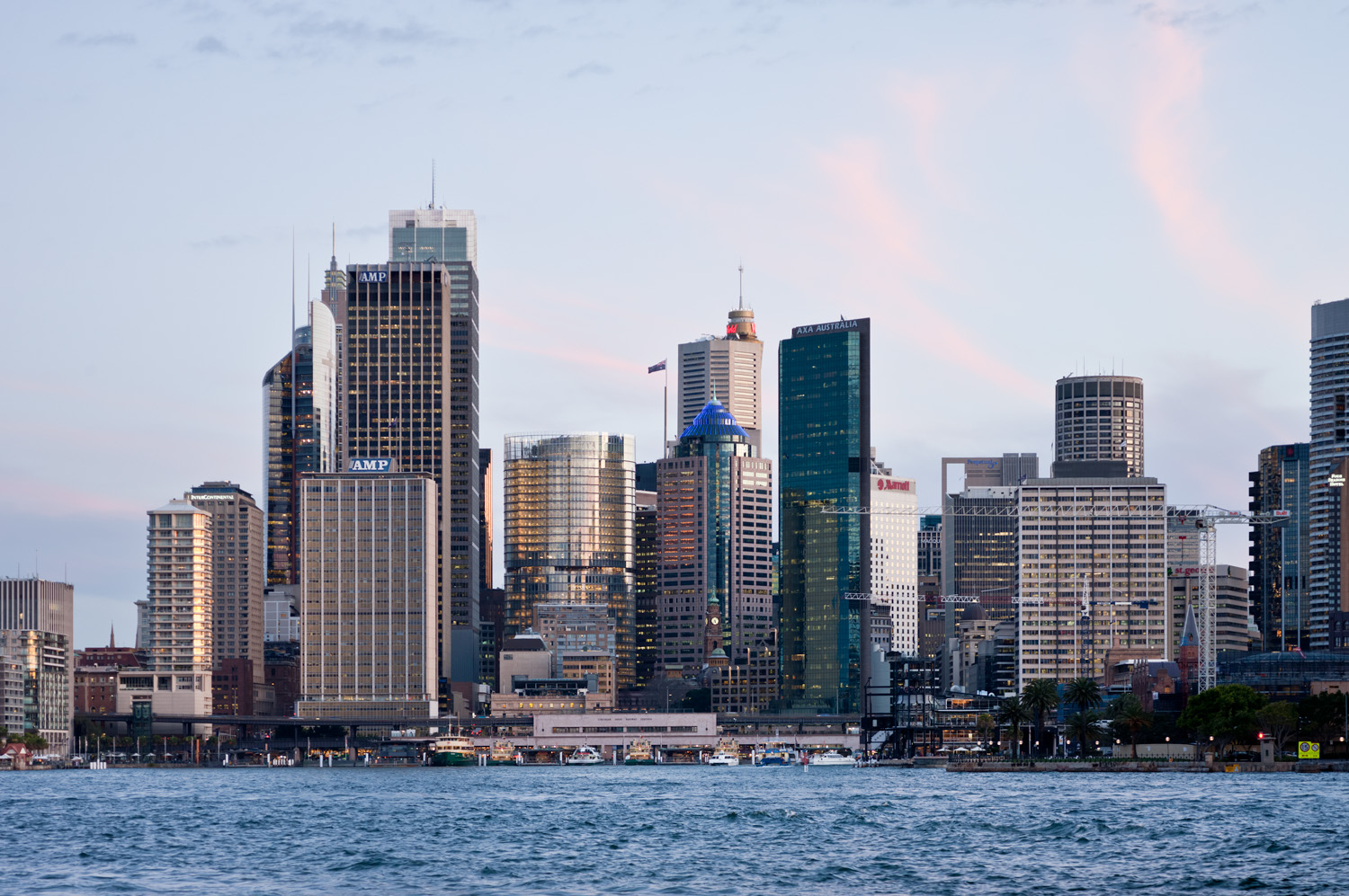
Figure 1. 1 Bligh viewed from Sydney Harbour.
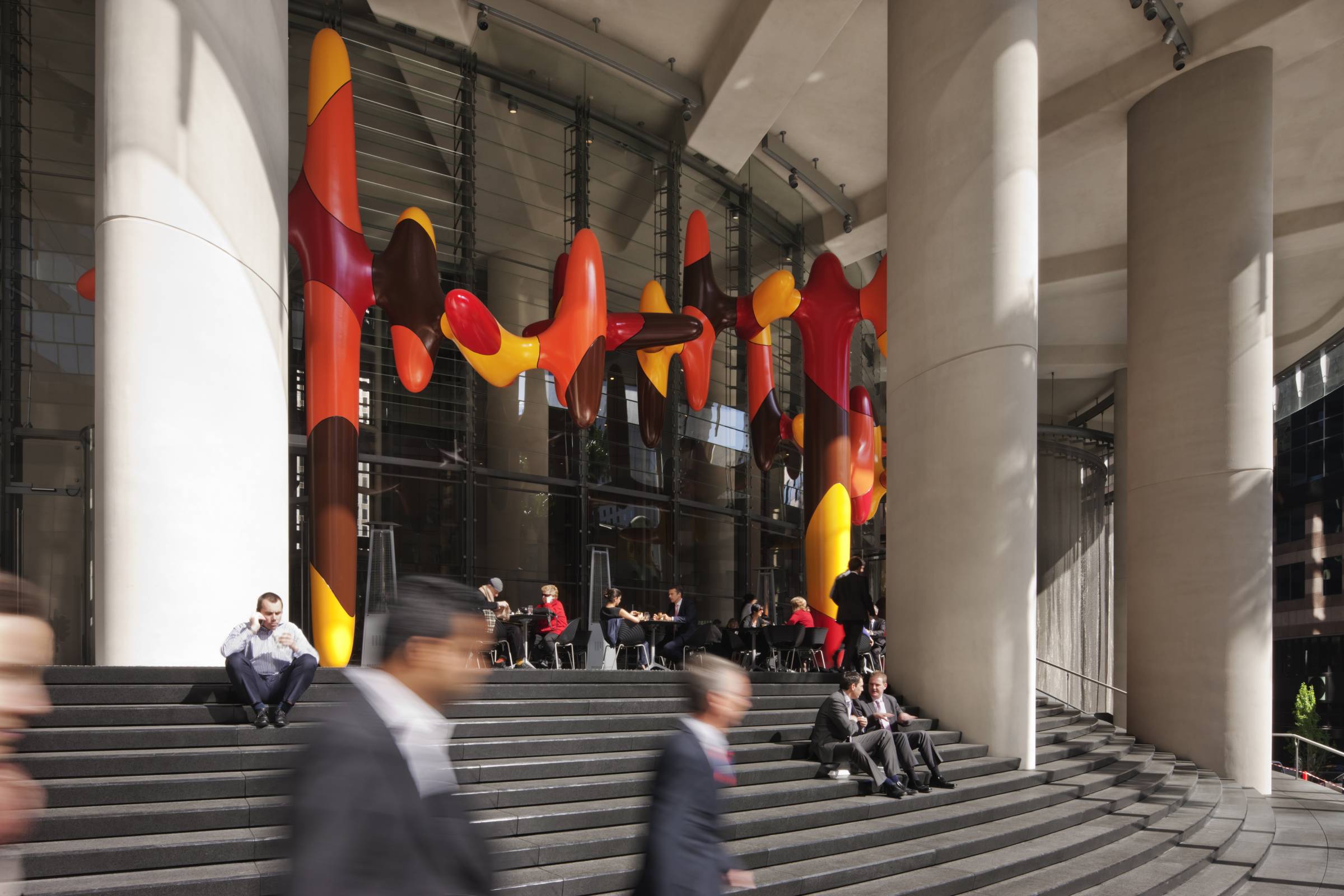
Within days of the building’s opening in July 2011, the difference was palpable. The café beneath the vibrant ellipsoidal sculpture by James Angus was bustling, and city workers were lunching in the winter sun on the wide steps that look over Bent Street to Farrer Place.
In 2006, building owner DEXUS set a very specific competition brief for 1 Bligh, with a focus on amenity for tenants and sustainability – there had never been a Six-Star Green Star high-rise in Sydney before. And, the competition winners, Architectus in collaboration with Germany’s Ingenhoven Architects, designed a building that perfectly fulfills the competition brief.
It also meets an additional brief that the architects set for themselves, one that focused as much on social and cultural amenity and city planning. The result is a fully integrated building that engages in a conversation with its wider context. “With a competition, you can get a break-out solution,” says Ray Brown, Director at Architectus. “You probably wouldn’t have got this result working every day with a client.”
Each of the building’s many innovations – its double- skin façade, Six-Star Green Star rating, gas generators, automated blinds, chilled beams – is inherent to the base building. “The building,” Ingenhoven Architects’ Christoph Ingenhoven says, “solves all the issues with one answer.”
Figure 2. James Angus’ artwork, Day in Day Out.
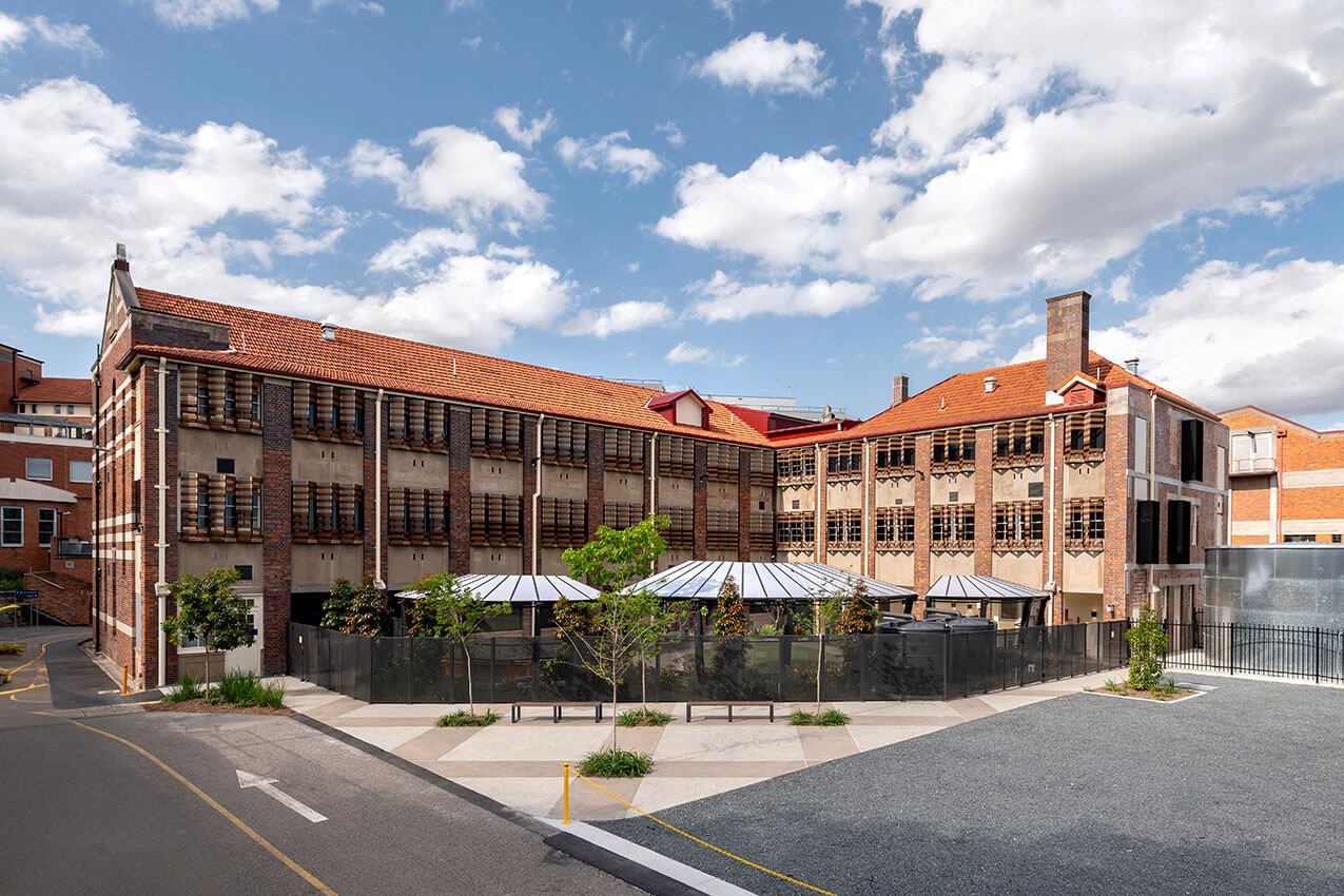
The active public space on the ground plane, for example, results from the architects’ solution to a twist in the city grid at the site of 1 Bligh. The normal grid in this area of Sydney faces the Harbour, aligning with the ferry wharves at Circular Quay. The two street blocks either side of the 1 Bligh site, however, create a grid at 45 degrees. If 1 Bligh were an orthodox rectangular building built to this grid, there would have been a corner facing the Harbour and Farrer Place would have been boxed in further. By making it elliptical in shape, the architects twisted it around as far as possible, addressing the view to the Harbour, and resolving the complex geometries of the two grids meeting, with the benefit of creating public space.
One of the key concerns in the design of 1 Bligh is view, both external and internal. The floor plates sit between two structural cores – one that faces the closest neighbour, blocking that view, and the other that faces the tallest neighbour – and the majority of the office space is thus opened up to spectacular views of the Harbour Bridge and the city.
Meanwhile, the central full-height, curved glass atrium creates internal lines of sight that facilitate a sense of community.
Figure 3. The atrium.

“There is a fantastic transparency,” Brown says. “It’s almost like a vertical campus.”
Visitors walking into the dramatic 130-metre high atrium with skylight overhead are struck instantly by the stripped-back appearance of the building, which has been described by some as ‘naked’. nothing is superfluous, and everything is on show. “It is just what it is,” Ingenhoven says. The elevator engines are boxed in glass at the top of the atrium, and the plant room on level 16 is a glass-fronted showcase of engineering ingenuity with special lighting that highlights the symmetrical layout of carefully designed air handlers. “I think that is one of the most important things in sustainable architecture,” Ingenhoven says. “It is about accessibility, visibility. Things you don’t see, you don’t feel responsible for. If things are exposed, they are properly designed and maintained.”
The atrium also plays a role in 1 Bligh’s sustainability program, bringing fresh air into the building and complementing the hybrid air conditioning that combines variable air volume with a chilled beam system. This results in a varied interior environment, which is especially evident in the break-out balconies on each floor, where there is a transition from air- conditioned to naturally ventilated space.
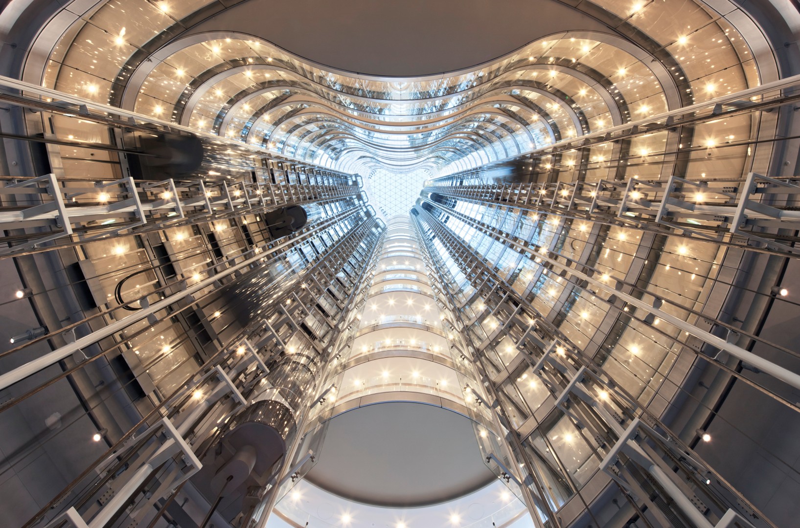
Figure 4. Looking up through the atrium.
Other features contributing to the Six-Star Green Star rating include the double-skin façade with an outer skin that protects the sun-shading system, shields the internal glass skin from the sun and reflects natural light into the building; tri-generation system; solar panels; black water recycling; and recycled rainwater.
Figure 5. Solar panels are integrated into the roof design of 1 Bligh.

It is clear that 1 Bligh is a landmark addition to Sydney’s CBD that sets new benchmarks in its sustainability outcomes and the way it addresses social and cultural issues. It would have been difficult to realise such an ambitious project, however, without the early commitment from anchor tenant lawyers Clayton Utz, which came at what was a very unpredictable period in the global economy.
Clayton Utz had been negotiating with DEXUS for eight months before it signed an agreement for lease at the end of 2008, in the midst of the Global Financial Crisis, just after Lehman Brothers declared bankruptcy. “They made a big commitment at a very rocky time in the economic cycle,” says Tony Gulliver, Head of Development at DEXUS. “They seem to be very happy.” It is a sentiment that Julie Levis, Partner in Charge, Sydney, at Clayton Utz, agrees with. “It was a difficult decision,” she says. “But, everyone is delighted.”
Clayton Utz is located in the first 15 floors of the building – the first of which actually begins 20 metres above the ground plane, providing security and access to views. Bates Smart was its obvious choice for the fit-out, as it had worked on the refurbishment of the law firm’s Melbourne offices and was familiar with the Clayton Utz culture. The Bates Smart team worked closely with the base building architects to ensure a seamless fit-out, and it is difficult to tell where the base building design ends and the fit-out begins.
Figure 6. Level 15 floor plan.

While the irregular floor plates of 1 Bligh would have been perfectly suited to an open-plan workspace, and the option was explored in early focus groups, this was not an option for Clayton Utz. “Our people had zero appetite for open plan,” Levis says, primarily for reasons of acoustic privacy. While the office layout may seem traditional to outsiders unfamiliar with Clayton Utz, it represents a fairly large cultural shift for the firm. The offices, for example, are of equal size in an attempt to reduce the workplace hierarchy and churn costs. “It took us quite a long time to get an optimum outcome in terms of the numbers of offices that could be achieved on each floor while maintaining views through the building and the benefits of natural light,” says Project Director at Bates Smart, Simon Swaney.
The double-skin façade system to the base building was designed by Architectus and Ingenhoven Architects to bring high levels of natural light in, so it was important that Bates Smart maintain this. In not being tinted, the façade’s glass is unusual. “That makes a completely different environment inside,” Ingenhoven says, and this informed the material selections made for the fit-out. “Because it is not filtered light,” Swaney says, “you can afford to use colours that are a bit stronger.” This is apparent in the raspberry and blue accents throughout. Natural materials – the timber feature ceilings, for example – also respond well to the natural light.
Even the fire escapes at 1 Bligh are filled with natural light and have views out over the city. They are so far removed from the dark, malodorous fire escapes that we are accustomed to that Clayton Utz staff often use them as circulation between floors.
Visitors arriving for Clayton Utz are greeted on the ground floor at the 1 Bligh reception desk. The practice then has the option of reception either calling someone from the office down to bring them up, or of giving them a security pass. Express lifts take visitors directly to its reception on the arrival floor, level 15. A curvaceous white stair that derives its form from the geometry of the base building connects to level 14, where visitors can wait. As arrival floors, levels 14 and 15 have slightly higher ceiling levels to accommodate the feature timber ceilings. Like the sculptural staircase, the feature ceilings, custom fish-scale tiles on the floor in the circulation spaces, and library pods in break-out spaces, all take their design cues from the base building.
The library is one area in the Clayton Utz fit-out where a significant level of cultural change from the previous premises can be seen. In its former office space, the library was hidden away. Staff interacted with librarians primarily through email, and books would be delivered directly to individual offices. At 1 Bligh, however, the main body of the library has been incorporated into the café, which is affectionately called ‘Café Clutz’ after the in-house nickname for the firm. This change has seen more staff actively engaging with the library and librarians, and also provides a space for collaborative work and mentoring. Specialist library pods are located on the relevant office floors, giving easy access to the staff who need to use them. The library and work pods on the open-air break-out balconies provide not only a variety of spaces for staff to work in, but also areas for clients who may need to work between meetings.
The building is connected to its wider context in a multitude of ways, not the least through the outdoor deck spaces – one on level 15, which Clayton Utz uses for functions and to entertain, and one on level 28, with breathtaking views over the Harbour and the city.
Figure 7. Level 28 outdoor deck.
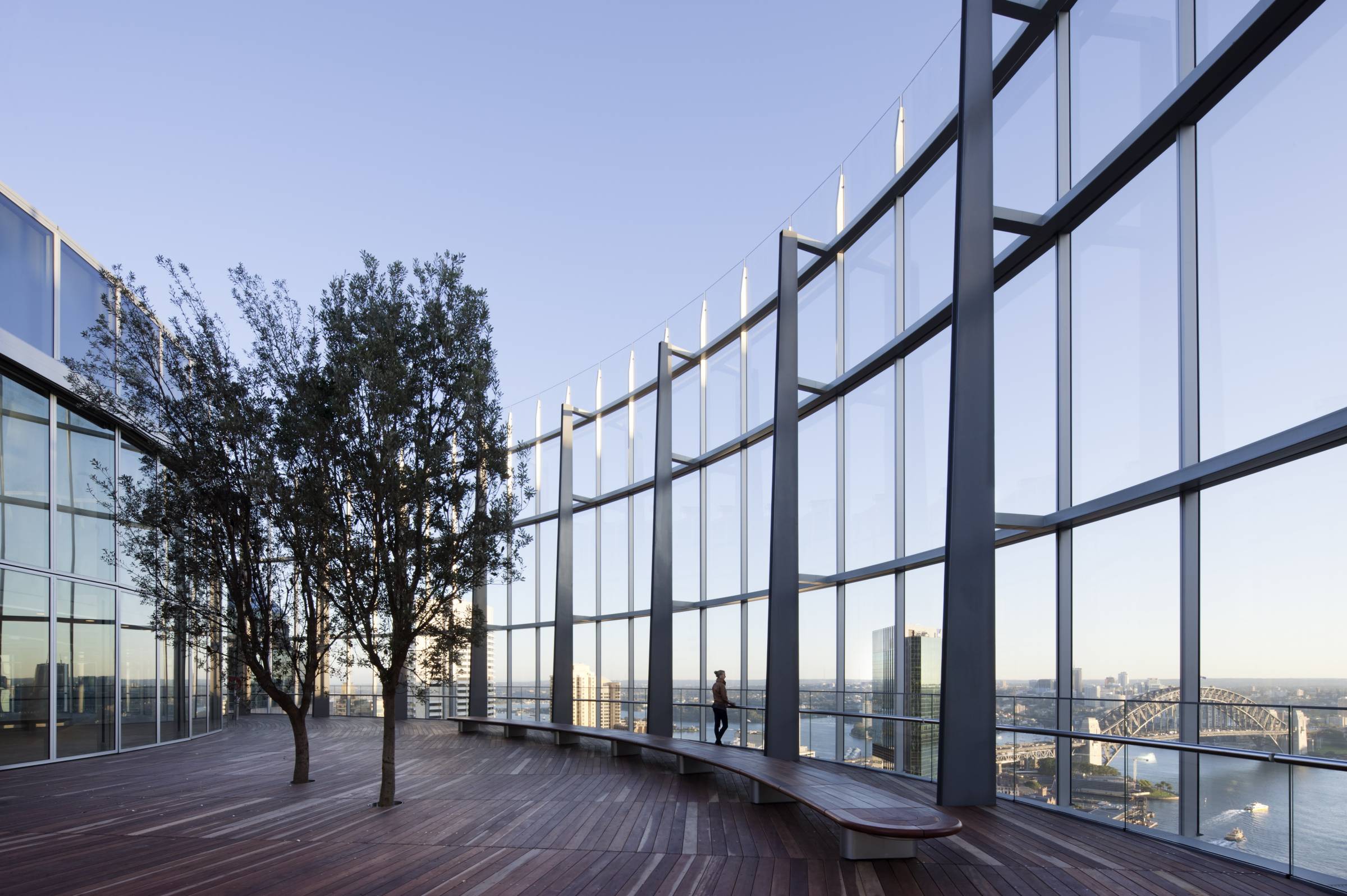
The space on level 28 is particularly innovative, as most outdoor equivalents at this altitude in the city are close to unusable, due to strong winds. Architectus and Ingenhoven Architects have designed a clever balustrade system here, though, that renders the space usable almost all year round, even on a mid-winter’s night.
At the time of writing, it had just been announced that the Commonwealth Parliament Offices (CPO) would relocate this year (2011) from its current location at 70 Phillip Street, where they have resided for the past 20 years, to three floors at 1 Bligh.
It will be interesting to see how the CPO and other future tenants will take advantage of all this building has to offer, which is much, not only for the building’s various tenants and visitors, but also to Sydney’s CBD and the people that engage with its local area.
1 Bligh might not be the tallest or most conspicuous building in Sydney’s skyline, but it is sustainable in every sense of the word – environmentally, socially and culturally – and it sets new precedents for high-rise buildings in Australia and internationally.
Figure 8. Clayton Utz client levels.

This article was written by Mandi Keighran, Deputy Editor of InDesign magazine, and first appeared in InDesign magazine in November 2011.